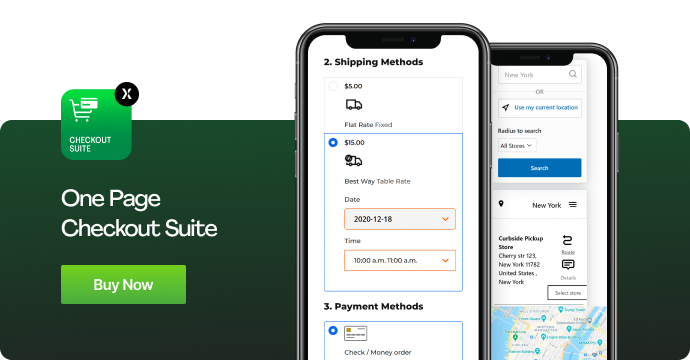
The tedious job of checkout in eCommerce business is an obstacle for many customers. The fact is, most customers suspend their order placement during checkout feeling the procedure is lengthy or complicated. Meaning that, you need to improve a lot of things to make it user-friendly. After all, bouncing back shoppers can harms your business sales.
So, why online visitors skip finishing the purchasing process?
Most commonly, shopping cart abandonment reasons could be the final price or hidden shipping cost. However, the recent studies show, that the increased number of customers abandon the checkout process due to the tedious checkout steps. This means, you need to make this page more user-friendly. Modifying the colors or text would not be enough as the process will remain same. You need to think big and start a new innovative concept.
Okay, so let’s determine what a customer may be seeking for while shopping on an eCommerce website.
Adding a product to cart will not increment your product sale. The truth is, when shoppers reach the checkout page, they first look at how long the page is. Ask yourself if your page requests irrelevant customer information. Is it a several-page questionnaire or a simple single page? Does your website have one page or multiple pages checkout process? Your strategy should take various factors into account.
The below information will help in understanding the Pros and Cons of One Page vs Multiple Pages checkout.
Table of Contents
One Page Checkout
Pros
Speed: Asking for only a one-page questionnaire is less tedious. Customers easily enter relevant information depending on whether they get every detail including the final price, shipping cost, delivery date, etc. A quick checkout process keeps your customer engaged with the purchasing process.
Improved Page Performance: Integrating Ajax checkout page enhances customers’ shopping experience. Pages load faster and customers find it’s easier than before. A user-friendly design will significantly add to customers’ satisfaction.
Smooth Navigation: Single page restrains visiting multiple pages to complete an order. The fields that are available on a single page help customers get a convenient overview of all the details on a single page. Thus, they won’t need to go back to find something.
Cons
Overwhelming Information: Restriction of displaying all information on one page tends to compromise a user-friendly interface. Customers often get confused or overwhelmed by several blocks/tabs located on the page.
Rechecking: With a multiple page checkout, rechecking product information is easier before the final confirmation. On single page, shoppers may miss some important details, or feel difficulty in selecting other products leading eCommerce checkout abandonment.
Multiple Pages Checkout
Pros
Finding Pitfalls: Suppose a customer has filled information in first page and abandon in second page. So having a Google Analytics tool, you can easily determine which page is killing the checkout process. Contrary, a single page only informs about customer abandonment, but does not the actual information.
Clear Layout: Bifurcating information on multiple layout favors clean picture of the checkout process. Customers finds short length information on each page that motivates them to move ahead.
Third Party Payment Gateway: Integrating several payment gateways sometimes needs adding an additional page to make a payment (a PayPal and other payment processors page).
Wholesale Process: Stores supporting wholesale process requires customer information to be filled on earlier pages before deciding the final discounted price.
Multiple Orders: Accommodating distinctive orders in multiple pages becomes easier to record customer information and streamline the checkout process. For example: gift orders on different addresses, special orders with extra requirements, bulk orders etc.
Cons
Page Length: Customers often feel disappointment on finding multiple pages during the checkout process. It’s common human behavior to lose patience while filling information browsing through multiple pages.
Deciding your Goal
At the end, it’s you who have to select the best approach for your checkout. Don’t go with the flow. There is no fixed checkout approach for online marketplace. The decision solely depends on your business goals and objectives. To improve your sales number, a user-friendly and faster checkout process is what required.
Author’s bio:
Yogesh Trivedi, an eCommerce consultant working with M-Connect Media, Magento Agency. He approaches every eCommerce projects with full dedication and professionalism. He has contributed towards superior work quality and maximum client’s satisfaction. Significant experience in presenting eCommerce strategies of planning, designing, development, and marketing to various clients projects.


