When you have a big flow of visitors, but a small number of purchases, it is time to ask yourself a question: “am I doing everything right?”. If your site failed to convert visitors into customers there must be something wrong with it. Read on to find out what may be hindering your conversion progress.
Your eCommerce website has visitors who are coming to make a purchase. When a purchase is made, it means that a shopper successfully passed the whole way from entering the website to completing checkout steps. This is basically what we call a conversion.
Say, if you have 10 customers and only 5 sales, the conversion rate is 50%. It is called a conversion rate and the process of its improvement is a conversion rate optimization or CRO. But 50% from the example is something about fantastic in eCommerce. In terms of competition and the abundance of choice it is almost impossible to reach such a rate unless you are not selling a unique product.
Conversion is a multi-step process that starts when the customer comes to the store and finishes, when the purchase is made. And mistakes are possible on every step of this process. In this article we are going to discuss the most common mistakes that may be stealing your profit.
Table of Contents
1. Complicated Sign-Up
The first conversion killer on the list is registration/creating a store account. Every customer has to deal with it sooner or later. As a rule, over-complicated registration path scares potential customers away, which inevitably leads to a drop in sales. That’s why the whole sign-up process should be maximally simplified.
In some stores registration is not even required – visitors can make purchases as Guests. It’s convenient, time saving and doesn’t make customers go through a boring sign-up process.
However, at the same time selling products in such a way can bring a lot of problems to a store owner. Collecting information, such as customers’ personal details, emails or certain shopper’s preferences is vitally important. That’s why when optimizing you need to find the happy medium that will satisfy both you and your customers.
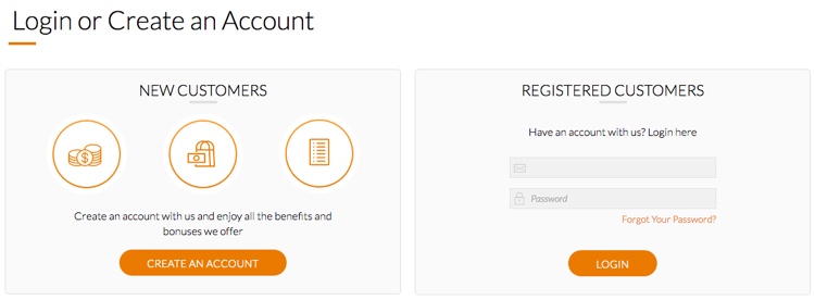
Simple and clear registration and login screen
As an option, you can let customers purchase a product without registration. And only after the checkout prompt them to create an account based on the provided information – thus, you skip a boring step of entering the list of personal details. This way, you increase the chances that a customer will agree to quickly create an account in your store and share all the details you need.
Alternatively, you may disallow unregistered customers to make purchases. That may seem a bit tough, however, if you offer something really great, customers will definitely go through the steps of the sigh-up process to get that.
And, in this case you may lure customers with certain incentives – that can be store reward points for creating an account or a sweet discount on the future purchases.
And anyway, during the sign up process you should ask as few questions as possible. Collect only the information that is really important for your business. The more extra questions you ask, the bigger is the chance that the shopper leaves the store.
Also, allowing visitors to sign in with social will be a good idea. This is the quickest way to create an account and there is no need to keep in mind a ton of passwords. Dropbox shows us a great example of signup form:
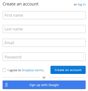
Takeaways:
- Provide customers with the ability to purchase both with and without a registered account
- Simplify the registration process by excluding extra questions and allowing social logins
2. Poor usability
Usability is the next conversion killer on the list. If neglected, shoppers decided to leave being frightened by website interface and entangled navigation. The fallout from bad usability and overall design is big, but the numbers below will illustrate it better:
- 85% visitors abandon a site due to poor design
- 83% leave because it takes too many clicks to get what they want
- 62% gave up looking for an item while shopping online
- 40% never return to a site because the content was hard to use
- 50% of sales are lost because visitors can’t find content.
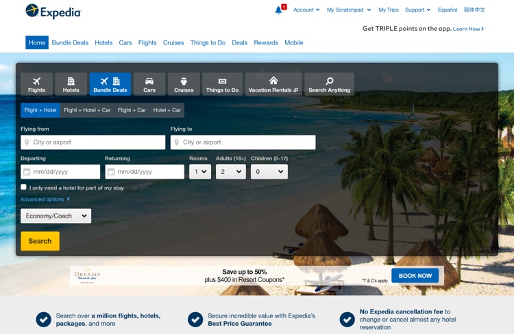
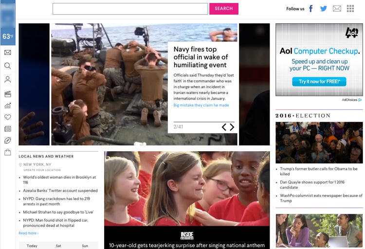
Enhancing usability is a complex matter, because there are too many variables in this equation. In general, you should pay attention to the blocks layout, choose readable fonts and make background inconspicuous. Each detail of the interface and design should be in the right place and play the right role. Moreover, the interface is something that you can’t stop making perfect.
Also, you need to pay much attention to your store’s navigation. HTML sitemaps are pretty old, yet very useful addition. On top of that, elaborated categories and groups of products will affect the conversion rate in a positive manner.
Here is the two opposite examples of website usability. I guess, it is pretty easy to say which one is good and which one has poor usability:
When talking about user experience, page loading speed should be mentioned as well – slow loading can seriously spoil your customer’s experience.
That’s why the optimization of the page loading speed is also important for the overall impression from the store. Moreover, it directly influences the conversion rate. According to research realized by different sellers, there is a direct dependency between page loading speed and conversion. Here is the example from Walmart:
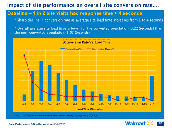
Even 0.1s page loading delay decreases conversion by 1%. That’s why the longer the customer have to wait, the less chance that a purchase will be made. To deal with this problem you can:
- modify website code;
- optimize visuals;
- switch to a faster server.
Takeaways:
- Interface should be balanced, convenient and user-friendly
- Optimize the page loading to speed up website browsing process
Worth reading on the topic:
Why You Should Care About Website Usability
5 Reasons Visitors Leave Your Website
3. Poor onsite search and the lack of search filters
Nowadays, nobody wants to manually browse categories to find a certain item. That’s why a search and filters should be an essential part of any store. It is important for the overall usability and better conversion rate. So, let customers find everything they need without problems and time wasting.
Nowadays the search is not just a page with a certain result, but a useful tool to increase conversion and ease the shopping process for visitors. You can modify the default store’s search with a number of additional features:
- search autocomplete – allows to instantly display results based on the entered text
- search autocorrect – helps customers to get exactly what they were looking for, ignoring typical mistakes
- search suggestions – are used to market products that are similar to the desired one.
It also would be a good idea to allow shoppers to add products to a cart right from the search pop-up window.
As you can see, there are plenty of options to enhance the search in your store.
That’s how the search autocomplete looks like at MageWorx.com:
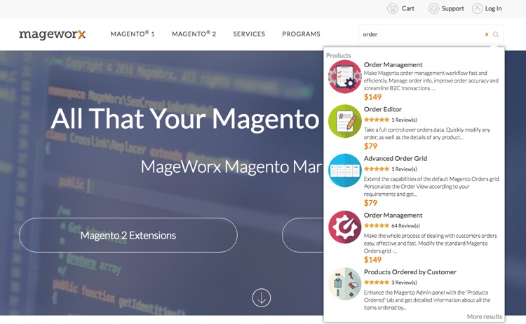
And the More results link leads us here:
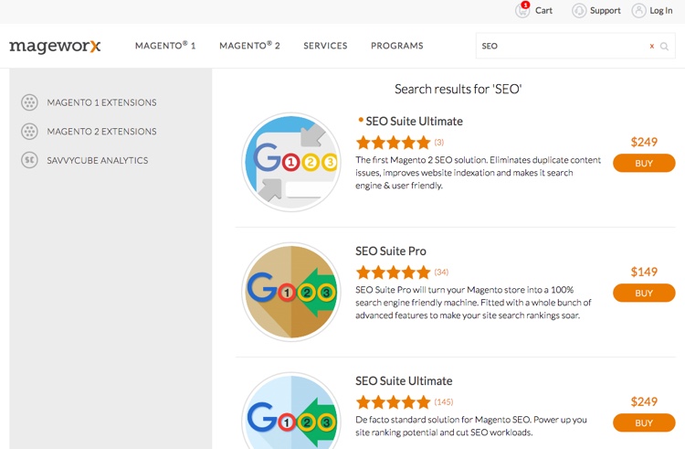
You can also switch categories to simplify our search.
Filters are a good and sometimes necessary addition to the onsite search. On the one hand, customers can manually define criteria to effectively browse through your products. On the other, they can search for a certain group of products and then filter it to find the one that required.
Takeaways:
- Search can be improved with the help of autocomplete, autocorrect, suggestions and other features
- Filters are a useful addition if you are selling groups of similar products with a few differences
4. Low quality product images, videos and sophisticated descriptions
When you are buying something on the web, photos are the only way to create visual presentation of how the product actually looks like. Customers can’t touch products or try them before they will be shipped, so the quality of the images, their background and the message they transfer are of great importance.
Not every store owner has the ability to manually create professional product images. In such situation it may be worth to ask for assistance. A lot of image enhancement services are ready to help transform an ordinary image to a beautiful stock photo. They can easily adjust lighting, change the background or even improve the entire quality of an image. That’s why it is pretty easy to make product images look better. Some useful services you can find below in the worth reading section.
Another way to touch the strings of customer’s mind is to place a product into the environment that resonates with the target audience. For example, products for kids will look natural with kids on images. In other words, people should see their avatars or the reflection of themselves in the images.
You can even make a step forward and provide not only a photo of the product, but a short video, where the product is displayed. Overall view of the product increases the possibility of conversion.
And last but not the least, is the product description. Text wall is not particularly popular nowadays, but it should be and should be made in the right way. Shoppers desire to read clear benefits of the product and this is the key. You may also provide more detailed description, but this is secondarily.
To illustrate the words above, let’s compare the two versions of one product page:
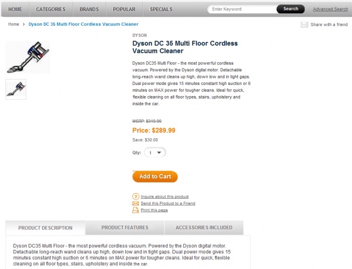
versus
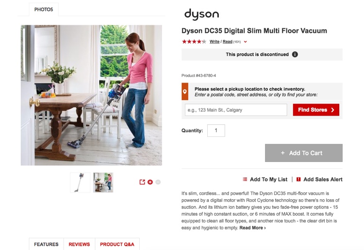
You can see the obvious difference not only in the usability, but also in graphics and text quality. The latest version even allows customers to watch the product video.
Takeaways:
- Quality images are good, full video is better. Both are important
- Text is only an addition to media and should be short, but descriptive
Worth reading on the topic:
25 Clever Ways to Optimize Your eCommerce Conversion Rate
Warning: Are These Four Ecommerce Conversion Killers Hurting Your Sales?
Image enhancement services:
Clipping Path Specialists
The Clipping Path
5. Lack of reviews
Reviews play a great role in promoting your products.
Hence, collecting reviews and encouraging customers to write them is very important to your conversion ability. It is good to encourage customers to leave reviews for the products that they bought. You can prompt the appropriate message after delivery or remind via email. At the same time, try not to be annoying, because this will have a negative effect.
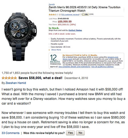
Also, you shouldn’t hush any negative reviews. They are not as bad, as you can imagine. Moreover, negative reviews add some trustworthy to other comments left in your store and a lot of opinions will guide the customers through the difficulties of choice.
To match the words above with numbers, here are some stats taken from the Bright Local’s study:
- 79% of customers trust online reviews as personal recommendations
- 73% of shoppers say that positive reviews make them trust a business more
- About 33% of customers need 2 or 3 reviews to form an opinion and 31% need 4 or 6 reviews.
That’s why the shortage of reviews may negatively influence on the conversion rate. If your store has been opened recently and hasn’t collected enough reviews, you may attach comments from well-known platforms and reliable sources that already has the same products. For example, from Amazon. They definitely don’t suffer from the lack of reviews. But collecting your own base of reviews is the primarily target.
Takeaways:
- Both positive and negative reviews are very important for product promotion and conversion
- The lack of reviews can be fixed with the help of external sources of comments
Worth reading on the topic:
Study: 79% Of Consumers Trust Online Reviews As Much As Personal Recommendations
11 Of The Most Hilarious Product Reviews On Amazon
6. No promotions, sales and specials
The next conversion killer may be as old as the hills, but it’s still a common very mistake. Fixed prices and insufficient number of specials is the one-way street to the bad conversion rate.
Promotions are actually an anchor that can attract and hold the attention of shoppers. Especially those who are regularly coming to your store and leave without a purchase. There is even a certain category of visitors that are browsing through different stores in search for sales. Using promotions, you can increase the conversion rate by attracting such folks.
Also, shoppers that come to your store to buy particular products can unexpectedly run into surprising special offers, which often leads to sudden purchases.
That’s why different kind of promotions usually has positive effect on the conversion rate of your store.
On top of that, one of the best ways to encourage customers to purchase from you is to offer some kind of personalized promotions. Sense of something personal in the offer raises the possibility of successful conversion. Extra personal discount, sudden special offer – all this methods will be appreciated by customers.
To understand the words above better, you can take into account the following fact:
According to the survey, held in January 2015 in the UK, 50% of consumers make a purchase only when an offer or promotion is involved.
Summing all up, all customers are waiting for a special offer to make a purchase. That’s why you should keep customers interested.
Takeaways:
- Specials and personalized promotions are vital to a better conversion rate
Worth reading on the topic:
Do Promotions Really Increase Your eCommerce Conversion Rates?
Pricing Psychology: How to Increase Sales by Charging More
7. The absence of Live Chat and Slow Support
Customers may often have various questions during the shopping process.
What will do the typical customer that has a question and won’t receive an answer? They are most likely to leave. Exceptions are very rare. Thus, to provide customers with a better shopping experience, you should give them all possible help or assistance.
The most common questions can be answered with the help of FAQ section.
The next stop will be a live chat, where each shopper can ask a question and get a quick personal response. This is another good example of personal approach importance. Customers don’t like to wait and waste time, they will rather make a purchase in other store, where there questions won’t stay unanswered. So, try to provide quick real time support that could handle the pressing issues.
Finally, due to various reasons some sort of technical problems can’t be resolved quickly. For that matter the support via email is used. In that case you have some time to prepare the detailed answer. Waiting time is also important, but not so vital as it suppose to be in the live chat. In addition, try to place all support sections and features to the customer’s view. Shoppers should always have the ability to get support.
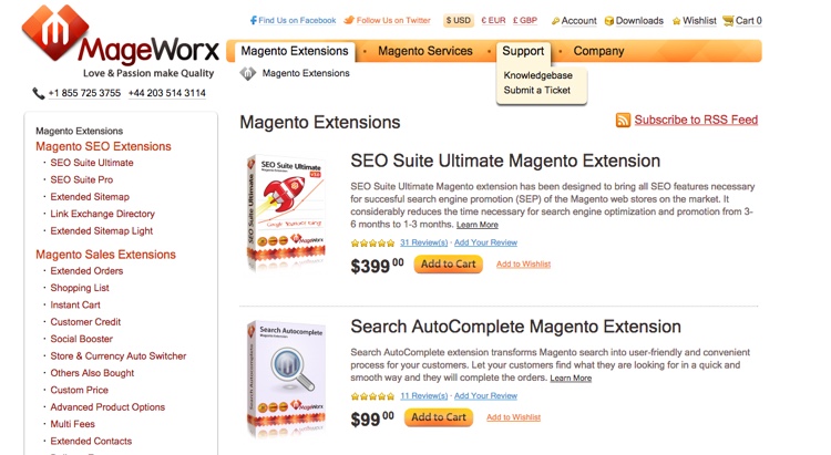
Compare the evolution of support at MageWorx.com. The old version of support page:
And the new one:
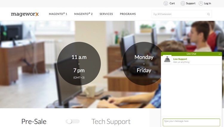
All in all, the quality of your dialogue with clients influence the overall impression of your store and possible changes in the conversion rate. Good dialogue can solve any kind of problem.
Takeaways:
- Support should be informative and coherent
- Each customers’ question should be answered as fast as possible
Worth reading on the topic:
How Live Chat Tools Impact Conversions and Why I Launched a Bad Variant
8. Insufficient number of shipping options
Shipping can also be a conversion killer.
Below, you can see that 3 of 4 main reasons of cart abandonment are closely connected with shipping:
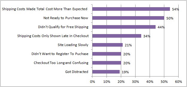
Hence, this aspect should also be optimized the best possible way.
Free shipping, as one of the options, is a must-have feature for any store.
Also, note that if you separately charge for each shipping method, you should get prepared for the drop in a store conversion rate. It will be better to spread the price of potential deliveries between all your products. Thus, it will be more convenient for customers to calculate the total price.
If you decide to go for Free Shipping only, you can increase your store profit by providing a range of alternative services. For example, you can offer services like gift wrap or rush delivery – that will be is a great way to somehow make up for shipping expenses and show that you care about your customers.
Splitting the shipping service by zones is also recommended to improve the effectiveness of your online store. You may charge more or less for shipping to the specific locations, deliver to certain areas free of charge and even restrict shipping services for some countries or regions.
Takeaways:
- Shipping should have a free option
- Shipping should be diversified for different shipping zones
9. Lack of payment methods and their security
Complicated checkout is a surefire way to lost customers at the very last step of the conversion process. To avoid that, make sure that you follow the steps below.
Maximally simplify your checkout. The fewer additional and unnecessary fields customers have to fill – the high the conversion is. Forget about long drop-down menus with dozens of payment options. Use automatic detection where possible (e.g. credit and debit cards), and add easy-to-understand options for other payment methods.
Ensure 100% security of each transaction. These days, people are very cautious about providing payment information. In some cases as many as 61% of shoppers decide not to finalize the purchase, if some sort of a trust seal is missing. Hence, you should use only reliable payment options and add security badges to the checkout page.
To sum it up, facilitated the checkout process with clear progress indicators and security badges will give your store an advantage over competitors. Shoppers will definitely appreciate the ease of checkout and the flexibility of payment in your store.
Takeaways:
- Checkout should be simple, but has to support a range of payment methods
- Ensure the security of each transaction
Worth reading on the topic:
5 “Trust Badges” That Can Increase Your Conversion Rate
10. Missing opportunities of recovering abandoned cart
If a customer postponed the purchase and left products in the cart you need to react.
Email notifications, special offers or even loyalty program can make the difference and turn over the situation. Also, you can think about retargeting ad to remind a customer about your store and the abandoned cart.
Don’t be too annoying trying to persuade shoppers to come back and buy your products, but try to convince. Notify and then provide a small discount or give customer a store credit to persuade to complete a purchase. Personalized offers can play into your favor again.
Abandoned carts is a routine reality for most of the stores. If you manage to pick the key for this problem, you will change the conversion rate in a positive way. With all the communication tools that available nowadays, abandoned cart in not the end, it may be just the beginning.
Takeaways:
- Always try to turn the abandoned carts into profit
- Provide customers with some benefits to persuade them to come back for their abandoned carts
Worth reading on the topic:
Lost Sales Recovery: How to Shape an Effective Cart Abandonment Email Campaign
Lost Sales Recovery: Crafting a Perfect Remarketing Message
10 Most Common Reasons for Shopping Cart Abandonment & Tips to Overcome Them
Shopping Cart Abandonment: Why It Happens & How To Recover Baskets Of Money
Bottom Line
These common and typical mistakes may killing the conversion eate in your store. The only way to avoid them is to constantly improve your store. Each situation is individual. Hence, one solution can show opposing results for different stores. That’s why you should always try something new, not be afraid to experiment and constantly monitor the results.
Phew, did I miss anything?
If so, feel free to add more conversion mistakes in the comments section below.


Enjoyed reading the article on top of, very explains everything in detail, the article is extremely fascinating and effective. Thank you and smart luck for the approaching articles
Thank you for taking the time to leave us such a beautiful comment! We appreciate that =)
very nice article it is very helpful. Thank you. I learn a lot.