Typically, online retailers focus on building a show-stopping homepage and perfect product pages. These pages get stuffed with eye-candy images, exquisite seductive product descriptions and clear CTAs. But there’s a page that can get as many views as all the above mentioned ones, however it’s almost always ignored by online store owners.
Yes, I’m talking about the category page.
The problem is: category pages are often considered as a fleeting stop and are given less attention by the store owners.
The good news is that there’re many ways to improve category pages & make them sell. Because a well-designed category page greatly helps to motivate users to drill down through this or that product, focus their attention, answer various questions and make shopping simple and quick.
So, if you’re looking to create category pages that sell, here’s what you need to do:
Table of Contents
#1. QUICK VIEW and SAVE FOR LATER
Visitors hate loading every single product page they like to find that this or that product isn’t something they want. Jared Spool, the author of a “pogo-sticking” effect or browsing effect, described in his studies that websites with a lot of back and forth visits from the category page to a product page in 89% of cases were less likely to convert.
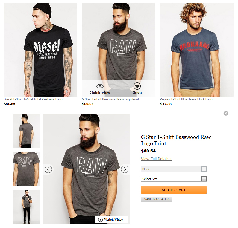
By using a “Quick View” feature you greatly enhance user experience and save time of your potential customers.
With the “Save for Later” feature you increase the likelihood your would-be customers will return and buy the items on your store. Because it’s easier for users to find the products saved for later than to start searching from the very beginning.
#2. MOUSEOVER (HOVER) EFFECT
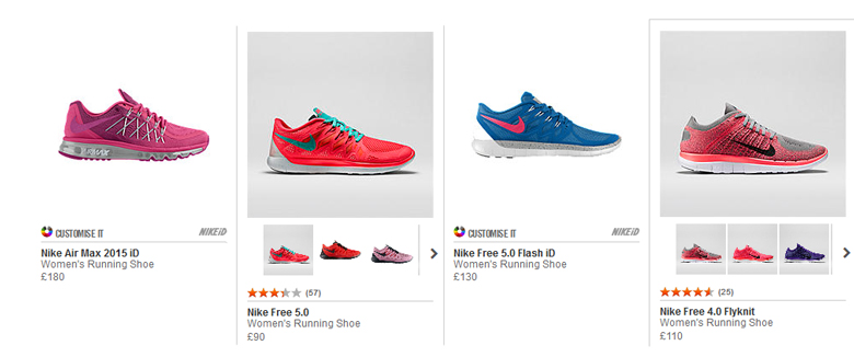
Mouseover effect reduces the steps users have to take to get more information about the product. Simply put, customers get all the details they need quicker than if they click a link. This effect will be helpful for those retailers who sell clothes, shoes/bags, jewelry, beauty stuff or any other product that customers need to see from different sides.
There’re several ways you can use the hover effect to improve your category pages:
a) Enlarge and show the back of your products
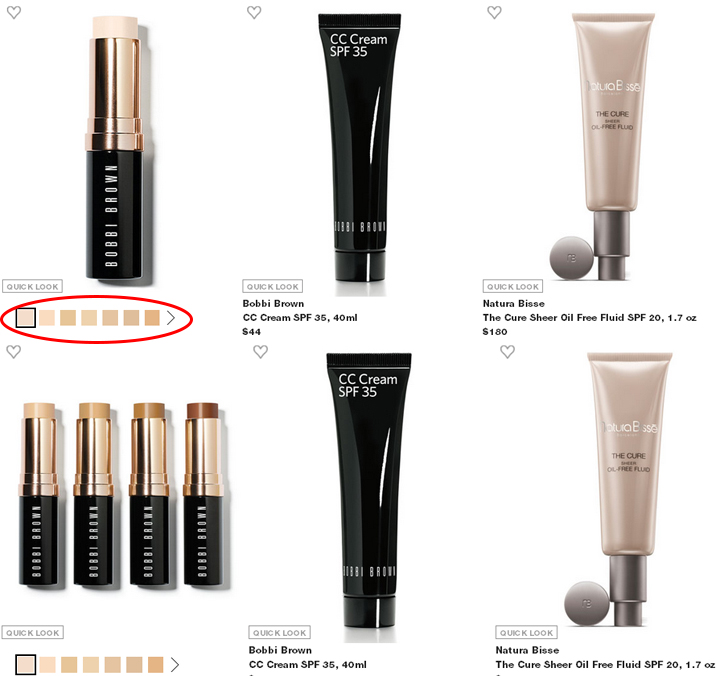
b) Allow switching thumbnail colors
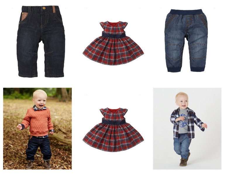
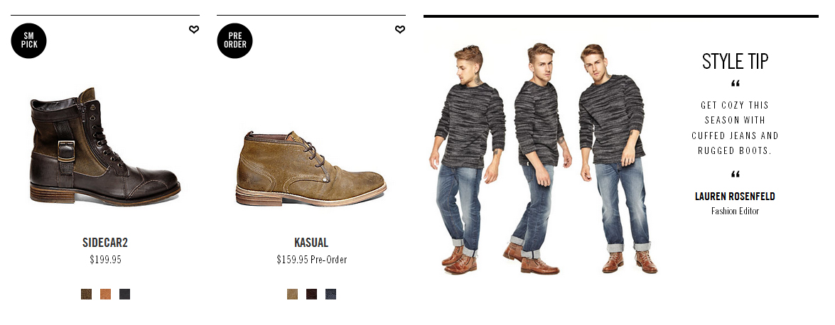
c) Show the total look with the item
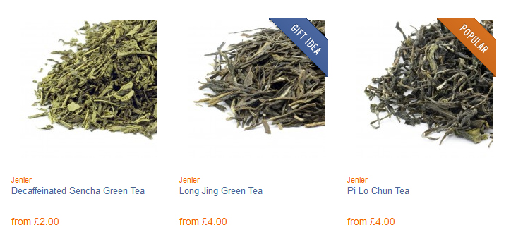
#3. BADGING
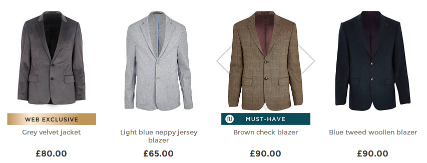
You can easily add extra attention, visually highlight and help customers focus on the products you want to sell with the trigger words. There’re endless possibilities for the virtual stickers from the “NEW” and “TOP RATED” to the “100% NATURAL”, “BEST SELLER” and “LIMITED EDITION”.
Tests show that websites with badges outperform sites without badges by 5%.
The only thing: Keep it simple and don’t overdo badging, otherwise you risk eroding consumer trust and lose their attention.
#4. RATINGS
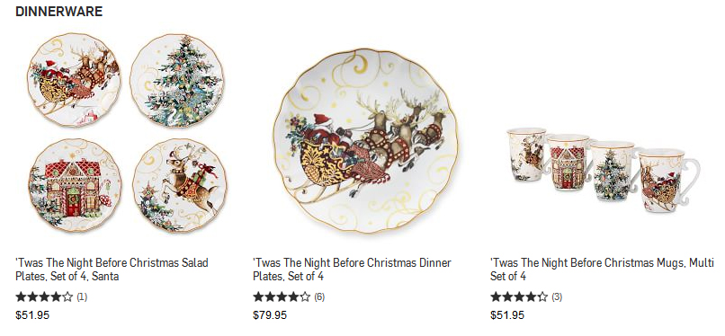
The power of social proof has significant influence in ecommerce. It can increase the buying rate, leverage user-engagement and trust plus generate conversions.
What to keep in mind: An endless list of favorable reviews doesn’t evoke trust. So don’t be tempted to display only the best ones or all negative feedback. People will trust you more if they see how you manage complaints and issues.
#5. SHOP THE LOOK
Lookbooks inspire users to buy. They save time and make shopping easy: no need to search for separate products and hope they will look great together.
Lookbooks make an emotional appeal and fire up the desire to buy, which is the important driver behind purchase decisions. Being mainly used on clothing websites, however they can be adapted practically to any industry. For example, you can start with Pinterest boards showing off your sports equipment and the photos of beautiful bodies. Motivate.
BOTTOM LINE
That said, you now know 5 things that can make your category pages rock.
Do you plan on using these techniques? Or maybe you already use one of these techniques? Feel free to share your experience with us by leaving a comment below.


