In the previous article, we’ve highlighted such an eCommerce phenomenon as a pop-up trigger, had a bash at classifying and characterizing the most commonly used pop-up triggers as well as analyzed the best use cases for them. Slowly but steadily though, let’s move from theory to practice and have a look at the real-life examples of pop-up usage.
Table of Contents
Examples of pop-up triggers
We’ve gone through dozens of randomly selected Shopify and Magento stores to dig out examples of pop-up usage that will surely get you inspired. Already testing the waters? Our solution – Magento2 Pop-up Widget – will help bring your boldest pop-up ideas to life!
It’s also critical to understand that sometimes it’s not a piece of cake for a regular user to identify which trigger or their combination have launched a pop-up. So, here’s what we’ve moused out.
Time delay/quantity triggers
Time delay/ quantity triggers are probably one of the most popular pop-up triggers along with the ones that make pop-ups appear some time after page load. Based on our research, about 85% of analyzed websites offer users to register or enter their emails in return for a discount on the first/ next purchase. This for the nth time confirms the effectiveness of such pop-ups for list building.
Right after page load
Tropical Sun
Image is clickable.
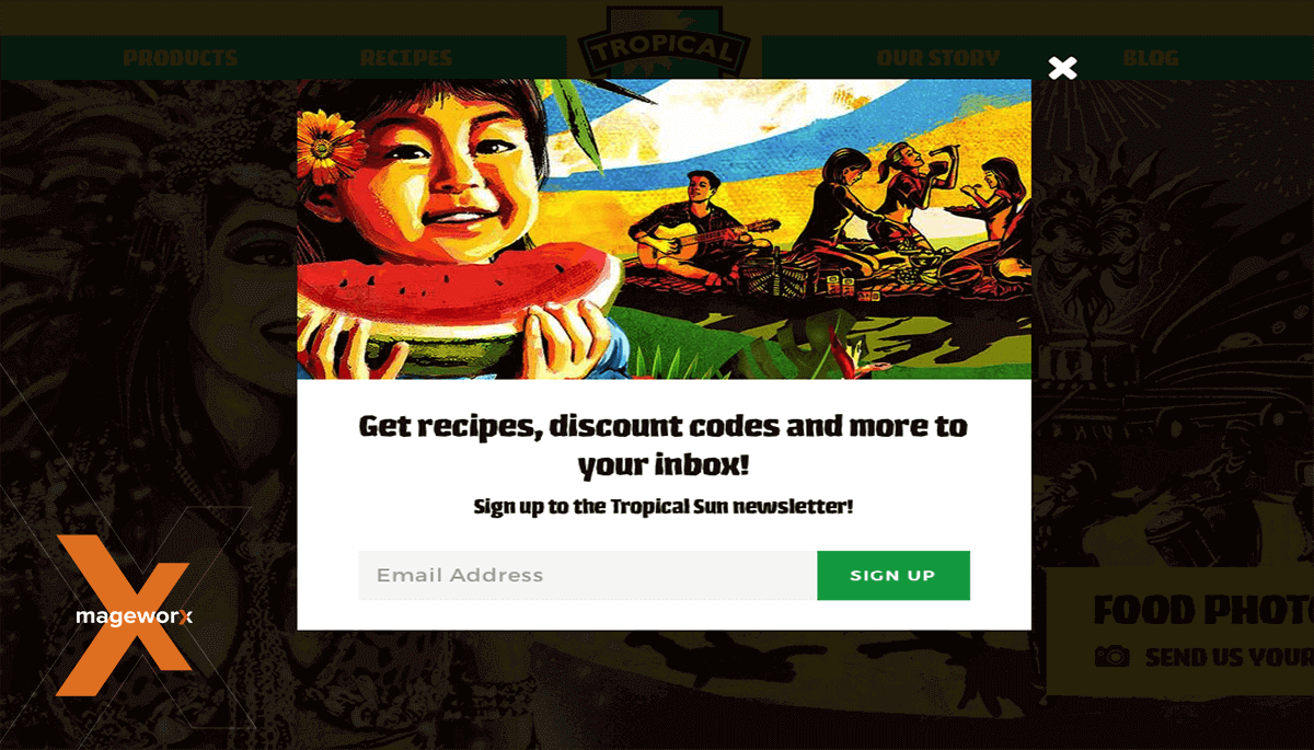 This is one of the multitude examples of such triggers, which launches an overlay pop-up as soon as the home page of the website loads and offers site visitors to sign up to a newsletter, receive recipes and discount codes.
Taylor Stitch
Image is clickable.
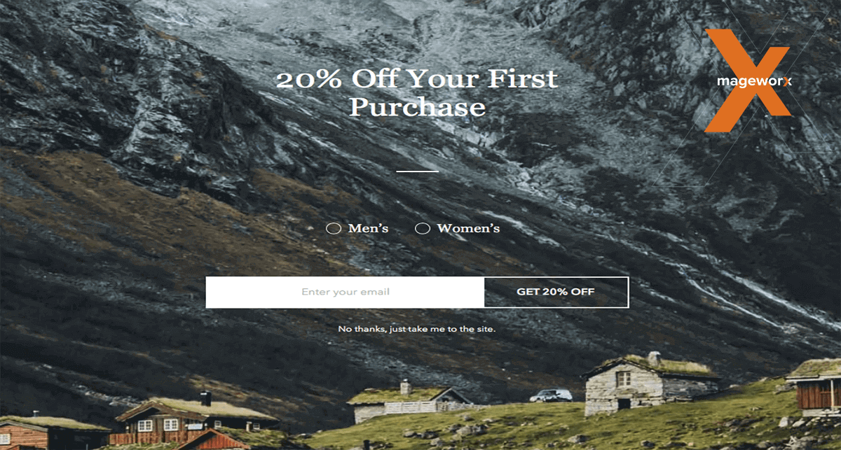 Another example of such a trigger is Taylor Stitch’s website, where a pop-up overlays the whole screen and offers 20% discount on the first purchase after providing an email address. Despite the beautiful UX, I’ve personally found it disturbing to have to click on ‘No, thanks. Just take me to the site’ button, which is written in teeny-tiny letters rather than letting shoppers click anywhere outside of the pop-up window in order to navigate away.
Katherine Hooker
Image is clickable.
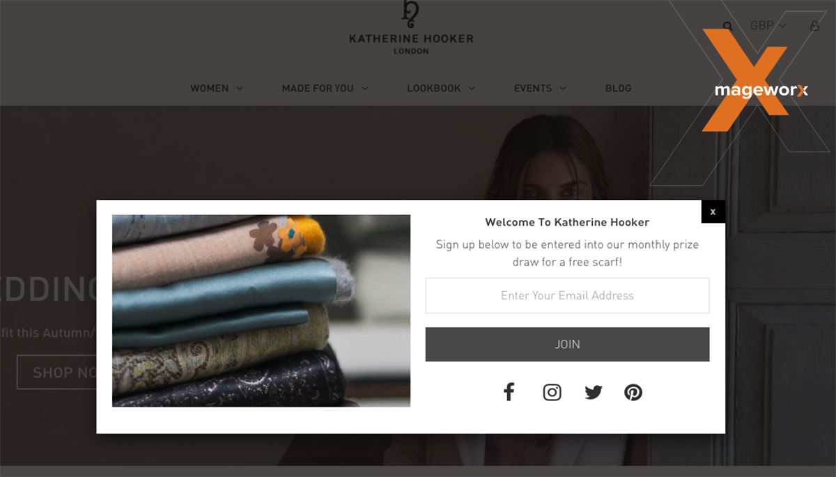
Here, visitors are asked to share their email addresses in order to participate in a monthly prize draw for a free scarf! Everyone just loves getting something for free! Remember the Hershey’s Kisses experiment? Let me remind you, if you don’t. In one trial of a research, students were offered Lindt Truffle for 26 cents and a Hershey Kiss for 1 cent. 40% of the students chose the truffle, and 40% – the Kisses. When it was decided to drop the price of the candies just by 1 cent, 90% of students opted for free Kisses. Therefore, free goods and offers are always a win-win solution!
‘X’ number of seconds after page load
Shwood Shop
Image is clickable.
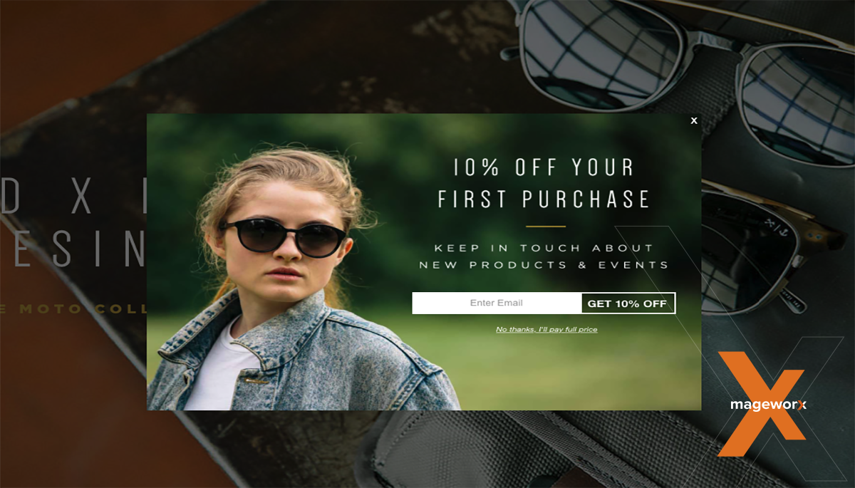
A lot can be said about the importance of pop-up timing, and I won’t reinvent a wheel by saying that a time frame of 5 seconds is considered an optimal one. This timing is used by multiple websites, including Shwood Shop, the online sunglasses retailer. It actually combines timing with the trigger that is based on user visit history. It targets first-time visitors and offers new shoppers 10% off their first purchase.
The Colossal Shop
Image is clickable.
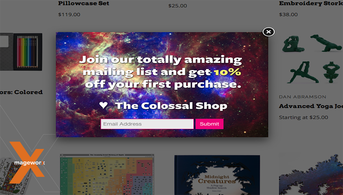
Nevertheless, timing should be carefully thought over depending on your business model and products/services that you offer. Thus, 5-second-rule is surely not a ‘cure-all solution’. For instance, the Colossal Shop has chosen to show their pop-ups on the 10th second, and the company probably has all the reason to do that. So, conduct a profound research in advance!
‘X’ seconds spent on the entire site & ‘x’ number of pages visited
When it comes to time spent on the entire site and the number of pages visited, we haven’t managed to take such triggers by surprise so far. That’s not to say that they are ineffective. Why not trigger your shoppers into finishing the checkout process with a timely pop-up that helps customers in their decision-making or offers valuable data?
Scroll trigger
JM & Sons
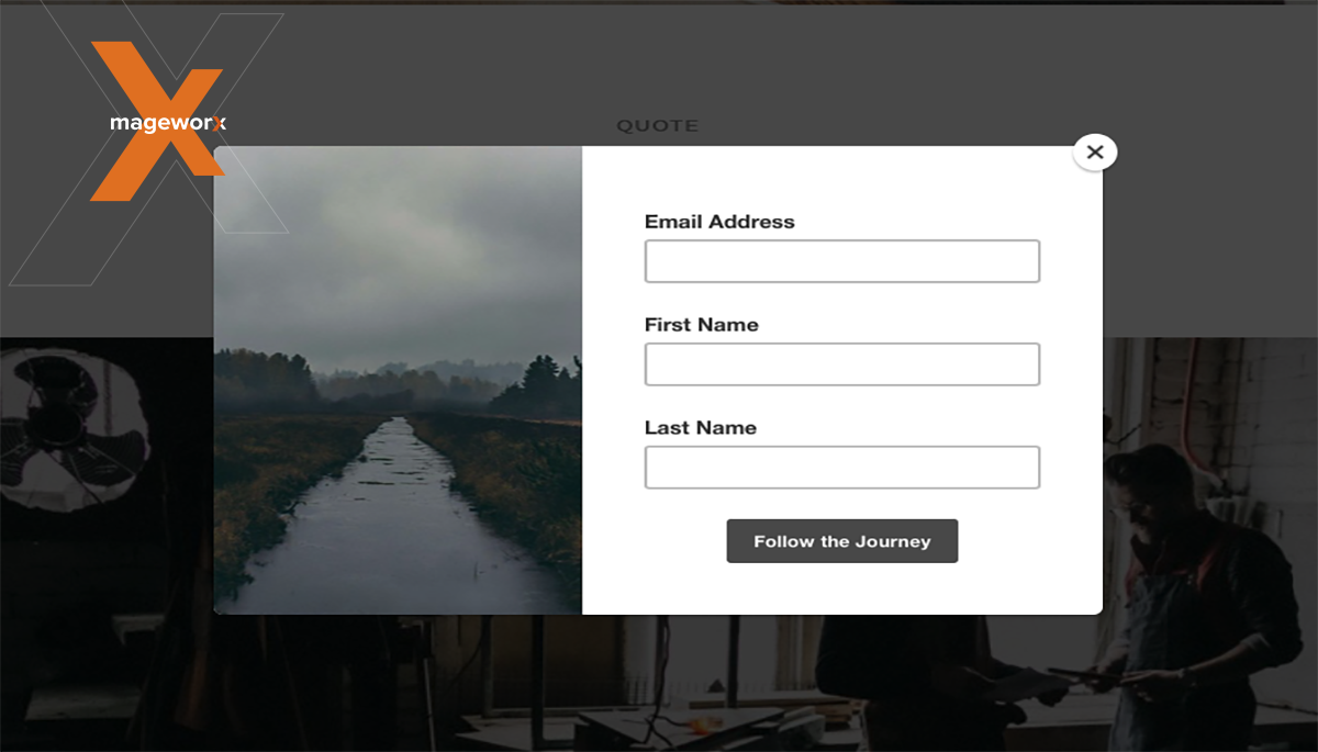
On the official website, you can experience a scroll trigger. JM & Sons is a family business, and visitors are treated quite personal when offered to ‘follow the journey’ by providing personal data (email and name).
Click open trigger
CA Modern Home
Image is clickable.
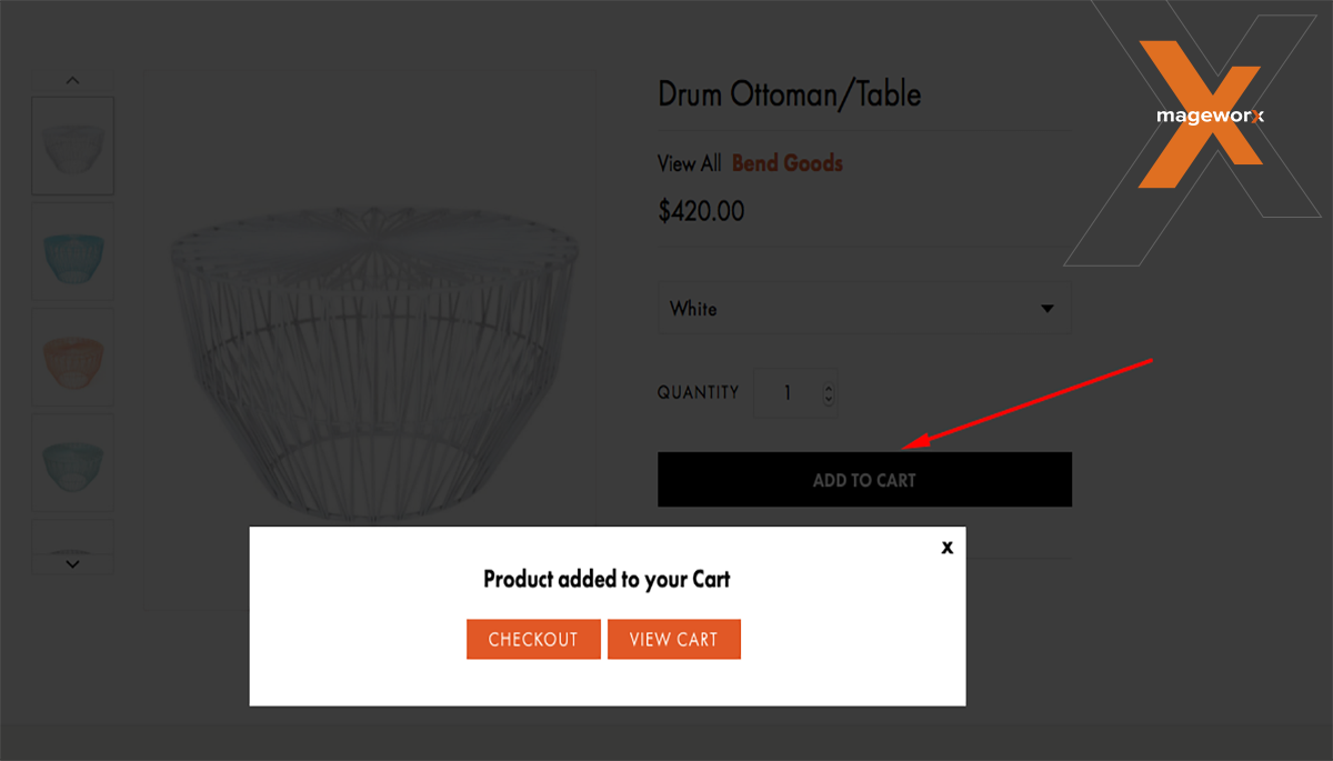
This company uses a click-open trigger on the website to reduce checkout abandonments and easily funnel shoppers. Upon clicking on the ‘add to cart button’, shoppers are offered to proceed to the checkout or have a look at their shopping carts.
On-hover or mouseover trigger
So Worth Loving
Image is clickable.
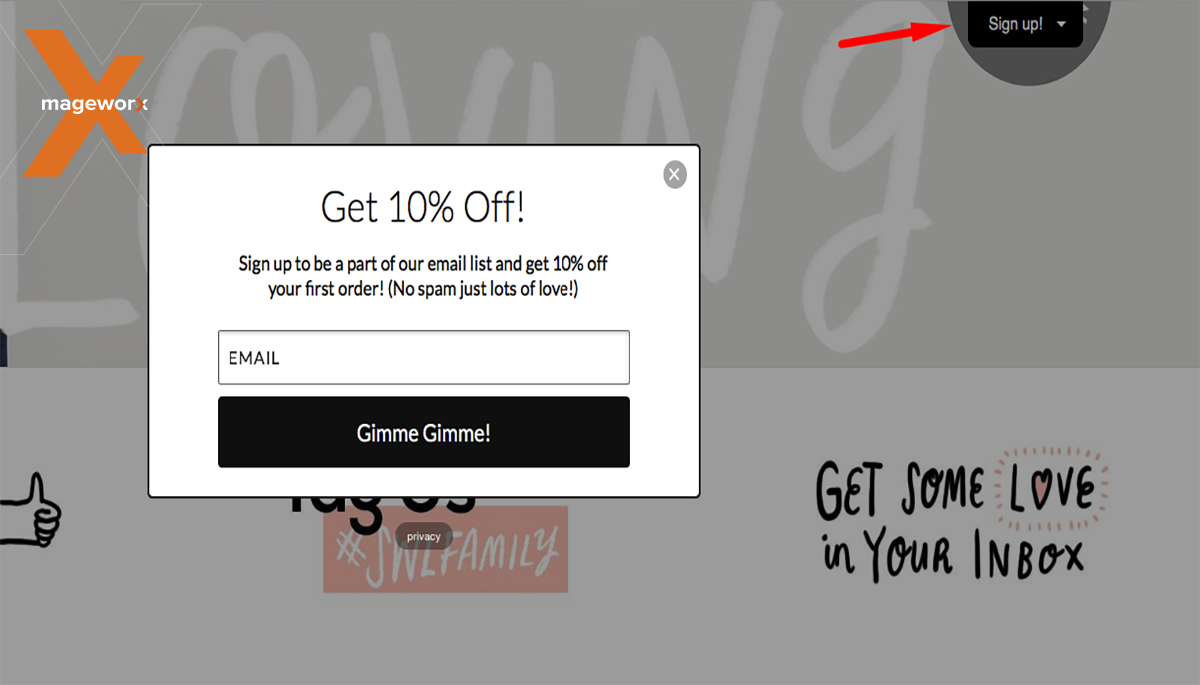
When hunting for pop-ups, we’ve come across a mouseover trigger on the official So Worth Loving website When mousing over the sign-up button, new visitors are offered a 10% discount on the first order after entering an email address. This is also a great use case for
Triggers based on user visit history and targeting first-time visitors
Egg London
Image is clickable.
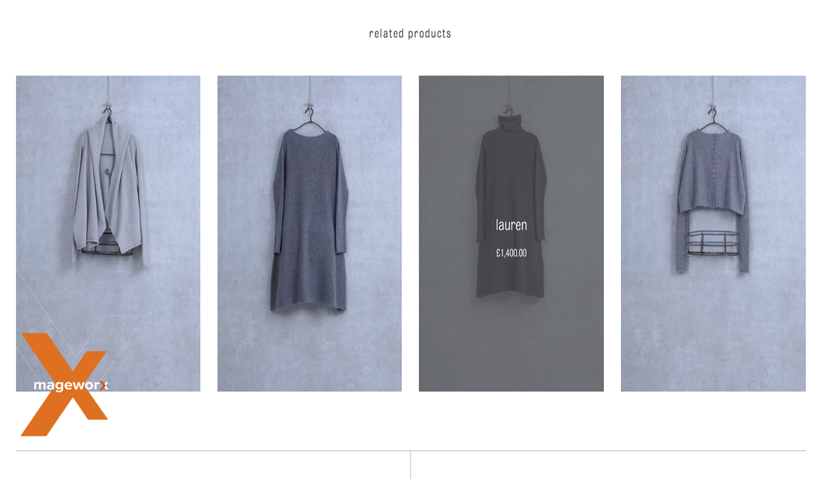
Also, additional data can be displayed with the help of such a trigger. For instance, Egg London uses such a trigger to display info about its items when users mouseover. This is quite convenient for shoppers to check out prices and extra data (like color, size) on related products.
Fiercely Curious
Image is clickable.
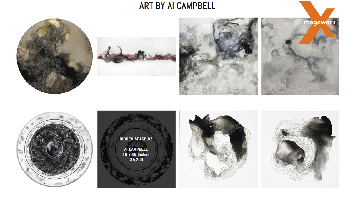
Such a trigger can be used to show additional data when numerous objects are offered and you do not want users to navigate away. Fiercely Curious sells multiple art objects and conveniently provides their shoppers with data on items’ name, size, and price.
Exit intent trigger
Such a trigger has been enjoying an increased popularity so far. It is seen by numerous merchants as a great way to retain customers.
Land Rover
Image is clickable.
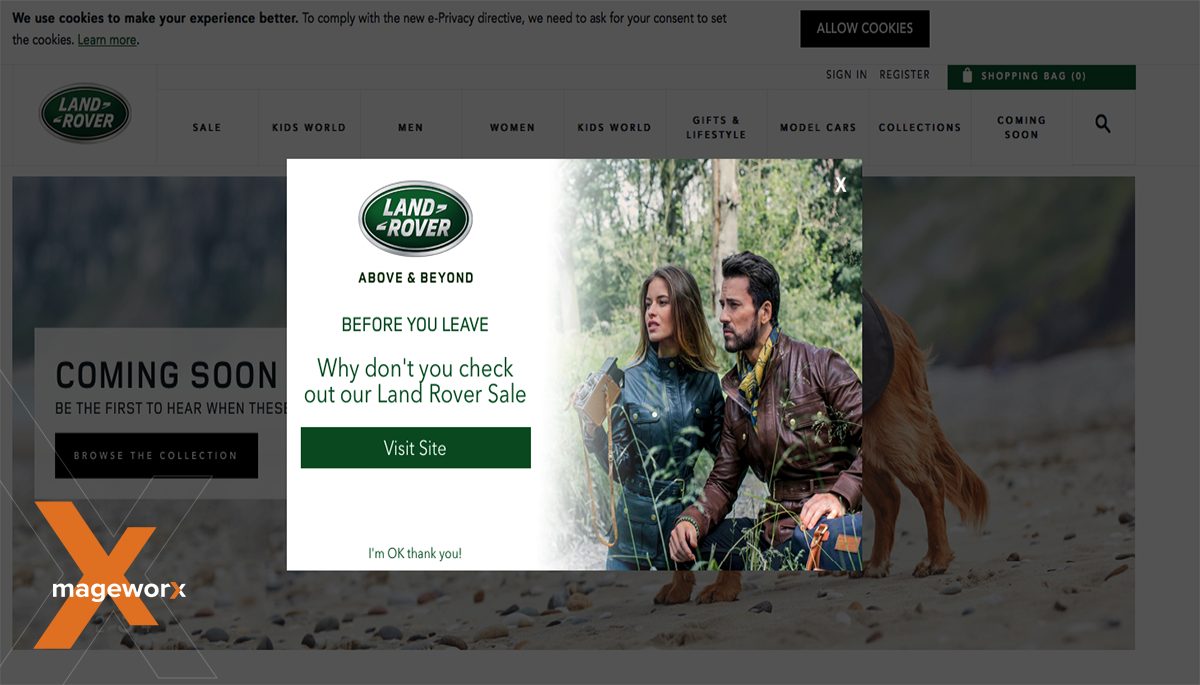
Land Rover website actively uses this pop-up to provide shoppers with valuable data on the ongoing sales when a visitor is about to ditch their website.
User history triggers
Trigger based on user visit history
Dowse Studio & Shop
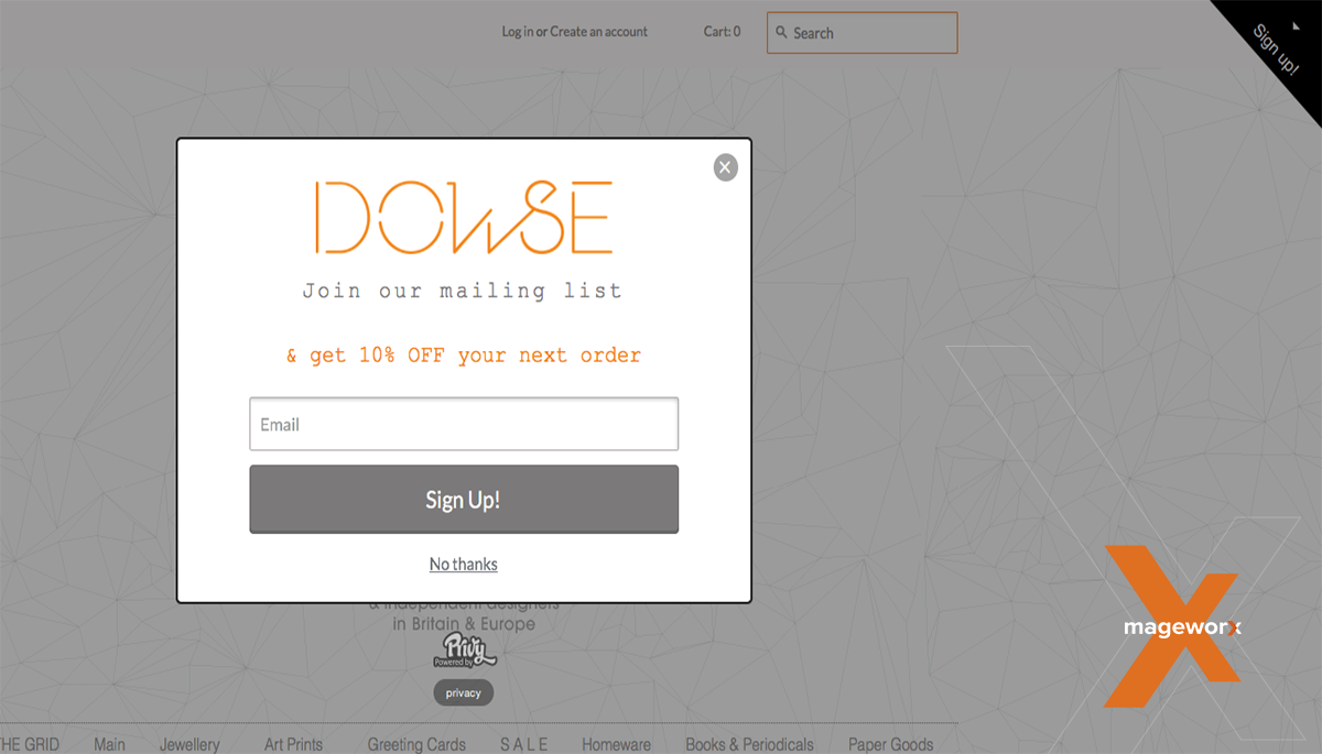
Such triggers are actively used as a combination with other triggers. However, some websites ignore collecting data on what category of shoppers (first-time or returning) visit their store. For instance, after opening Dowse Studio & Shop website, I was softly offered to sign up and to join the website’s mailing list in order to receive 10% off my next order right after that. My next order, what about my first one? Just thinking out loud.
Image is clickable.
Trigger based on user shopping history is not that easy to track. However, it does take place in eCommerce and must be carefully thought over after gathering data on your shoppers.
User-specific triggers and their characteristics
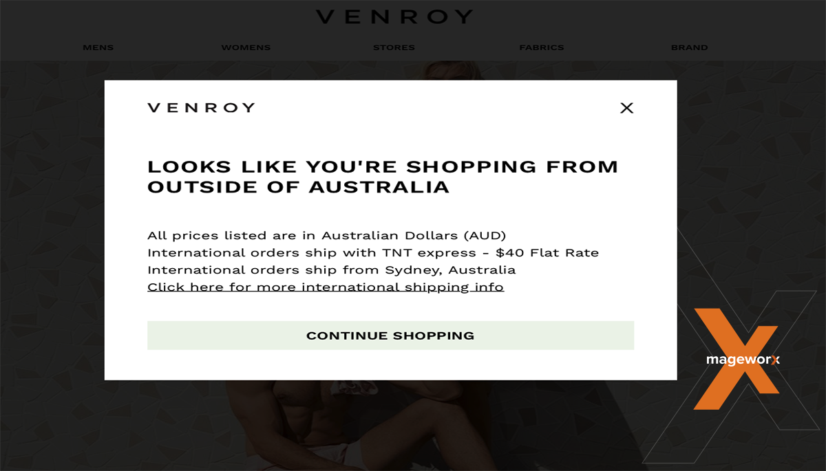
Choosing such triggers as device and user group depends solely on your website and where shoppers mostly come from and what device they primarily use. However, we’ve managed to catch the following location-based trigger off the guard:
Venroy
Image is clickable.
Venroy is a most beautiful example of how pop-ups can be used to provide valuable information to the shoppers. Having detected that an online shopper is outside Australia, it sends visitors a message concerning possible shipping charges and provides them with a link to the page with the detailed information on shipping, in the right place and at the right time.
Bottom line
There is surely a multitude of other pop-up triggers to be considered. However, they can be really hard to track and identify without access to website data (such as users’ referral path, buying activity or logging/ not logging in, for instance). In order to be a success and convert even more users, make sure to conduct a profound research of your target audience. Not to mention dealing with an experienced and reliable vendor that has cut his teeth on Magento solutions, including pop-ups!
***
Have you come across other beautiful examples of pop-up triggers? Feel free to share them in your comments below!




This was an extremely wonderful post. Thanks for providing this info.
Wonderful post . Thanks for share this post.
its very helpful,thanks for shearing.
Very informative article, Really wonderful post, Thanks
Thanks for sharing this creative information with us. Great examples and nice post.
Thanks for sharing your opinion on this article! We appreciate that =)
All of this are great. For me i like most land rover and shwood shop pop up. How much price is this?
thanks for sharing this.
Awesome blog, Very very informative, Thanks for sharing.
I read out your amazing article on real life. It was really exceptional. I would like to thank for the efforts you have made in writing this article & I hope to get best article from you in the future.
Really Your Blog is beautiful thanks for sharing
Thanks for the post and sharing the blog. Valuable and excellent post.
This is a most important blog and it’s very helpful for us. Thanks for sharing .
Impressed by the writing on a unique topic that must touch others mind, I think.
So informative post. Great experience share this post.
I’m just impressed after seeing your real life examples . Always i appreciate such educative post .
Hi, Solaiman! Thank you for taking the time to read and comment on the article!