The fact is: an average Web surfer utterly loathes pop-ups.
Imagine you are reading a cool post or want to click onto a website that looks inviting and – BOOM! A big-ass pop-up overlays the underlying page and impudently asks you for an email address.
The natural reaction to such an in-your-face message is to remove it as soon as possible. At best you will close an unwanted pop-up without bothering to read what’s on it. At worst – you’ll simply leave the annoying website not to come back again.
Yep, pop-ups are nothing like SEO. But multiple case studies did show that pop-ups can significantly increase sign-up rates and improve conversion and sales. Just look:
-
- using pop-up forms and hover ads doubled sales and increased signups build an extensive list of prospective customers and enhance conversions
As usual, the devil is in the details.
Table of Contents
Why Do People Hate Pop-Ups and How to Change This?
Patricia Williams, Wharton marketing professor, says that the main reason why pop-ups are universally hated is that a person sees them at the wrong time and in the wrong way.
“People have a more positive attitude toward the least interruptive ads. The Internet is a place where consumers don’t like to be interrupted,” says Patricia. “Invading my [e-mail] mailbox or my computer screen with something I don’t want is an inappropriate tactic in general,” adds Patricia.
That said, when it comes to online advertising, the usage of flashy, intrusive, obtrusive pop-up forms/hover ads pushes the boundaries of ethical behavior and drives site visitors mad. Hence, to reap the benefit of using this form of Web advertising, one needs to minimize the interruptive effect of pop-ups and make them maximally
- targeted
- timely
- relevant.
This is what to do to achieve it.
Know Your Audience
Before you launch your pop-up campaign, find out who you will be talking to.
Analyze the audience of your site visitors: study their interests and preferences, learn what they come to your website for, where they come from, which pages of your site are more popular with them.
Having this info at your disposal, you can craft a more effective pop-up form/ad and make your hover offer as personalized as if you were consulting visitors face-to-face.
Also, mind that you should be selective when it comes to displaying pop-ups. For example, it’s doesn’t make sense to throw sign-up forms at your regular customers (who are subscribed to your newsletter and already own the products you offer), or people who first came to explore your website, know nothing about your biz and have no buying intention (this category is technically hard to identify though).
Pick Up the Perfect Time
Timing a pop-up is another important factor to consider.
Generally, showing pop-ups at a startup isn’t a good idea. This is the case when you build an artificial barrier between your site visitor and the content they are interested in. That, in turn, triggers negative emotions, and in most cases, your message will be rightfully ignored by the annoyed visitors.
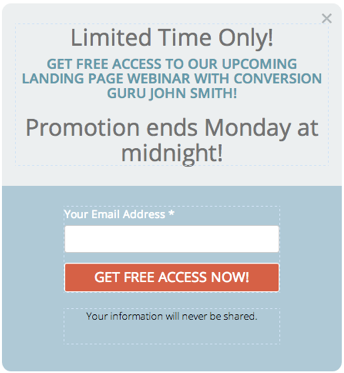
Despite entry pop-ups being mostly unwelcome, they can work in some cases. For example, a well-worded, and nicely designed pop-up that describes a special time-limited offer can justify your interruption.
However, you should be very careful with this type of pop-up form and never abuse it. Otherwise, people will just leave your site and hardly ever come back.
It’s better to give people some time before you display them a pop-up.
Scheduled Pop-Ups. Let them explore the page, enjoy your content, understand that they have landed on the page they have been looking for. If a visitor stays on the page for some time, this generally means they are interested in what they have found there. So if you display a popup on a related topic, presumably visitors will get engaged.
According to the research, the best time to show a pop-up is 60 seconds since the moment a visitor enters a website. However, depending on the quantity and type of content on a page, the boundaries of this time span can vary. So you need to run a series of tests to discover the pop-up display timing that is best for your every page.
This is a good example of such a pop-up by Elegant Themes. After about 30 seconds of being on their blog, visitors see this pop-up message.
Scroll pop-ups. These pop-ups work can also be a good option in this case. This type of a hoover message is displayed as soon as a site visitor has scrolled down a certain percentage (30-70%) of a page or a blog post. If visitors are well into page content, they are likely to get interested in what your pop-up offers.
For instance, when a visitor scrolls about 30% of the Visual.Ly Community page, they get this popup:
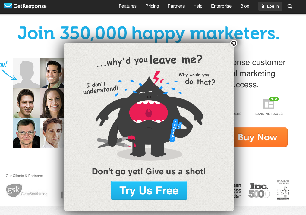
Exit Pop-Ups. This is another option to consider. This type of pop-up is displayed when a visitor is about to leave a page/website. According to some case studies, a well-executed exit pop-up can significantly increase leads.
This is a great animated example by GetResponse.Will you dare to leave the site and leave this cute monster crying?
Craft an Appealing Message
Headline. Like landing pages, pop-ups must have a catchy, attention-grabbing and convincing headline to make people share their details. Include impressive numbers, cool facts – everything that can immediately arouse interest.
Body. Below the headline outline the list of benefits a visitor will get after providing an email and personal details. But be laconic. Focus on the main benefits you offer and briefly innumerate them in your message. Also, it’s better when a list is written in a colloquial tone without using complicated terms or official language.
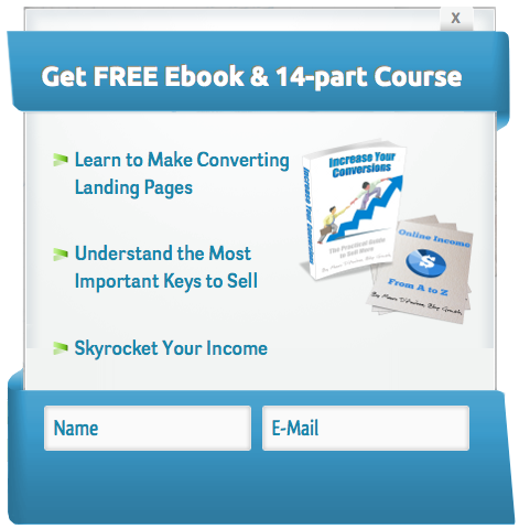
Design. And remember: all successful website popups are well designed. That doesn’t mean, however, that you need to hire a graphic designer to craft your pop-ups. There are lots of tools that can help you make your own hoover message visually appealing.
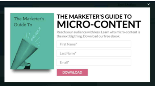
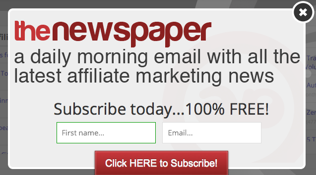
Below are the examples of really simple but nicely-designed pop-up forms by Affposts and Blog Growth.
Bottom-line
Timed pop-ups can generate leads from interested prospects. Integrate them into your online marketing strategies (with the smarts from this article) and you may just be amazed at how well they work.
List of useful tools that can be used for creating and managing pop-ups:
Wisepops
Marketizator
Screenpopper
Popupdomination
Optinmonster
Have something to say on the topic? Feel free to share your opinion in the comments below.





Landed on your post from Growthhackers blog.
Yes, you are right. Pop-ups do work wonders and help you achieve your lead generation strategy.
The message should resonate with your audience, which is very important which creating the pop-ups.
We at Qualzz, recommend our customers to use A/B testing to find out what is working better for their audience.